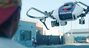
Most of the time, I work on accessibility projects – either as part of my job or volunteering for non-profits. It’s usually auditing or sometimes a bit of front-end web development. But a while back I had an opportunity to do something different: I made a small web site which was featured in a short film. Not a website for the film, but a website in the film.
The film is called Please Hold, written by KD Davila and Levin Meneske, and directed by KD. So far it has screened at a bunch of film festivals around the USA and the world. Along with winning a bunch of prizes, it took the honours for Best Short at the Florida Film Festival, which qualifies it to be submitted for Oscar contention. We just found out last week that it made the shortlist for the Oscar’s live action short film category, along with 14 other short films! We’ll find out in a month or so if it gets nominated.
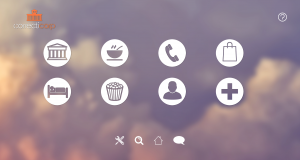
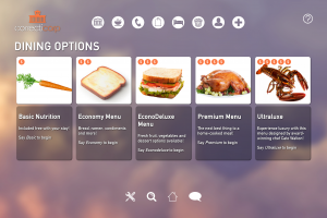
My husband Dave is a VFX guy and was helping out KD and Levin with this project. One of the things they needed was an interface for a prison system. It was going to be put on a big screen inside a prison cell, and the lead character would interact with it to make phone calls, order meals, and so on. In the past, Dave has found that doing this sort of stuff as a visual effect makes things difficult for the actors. They have to imagine what might be there and how they’ll interact with it, and that’s on top of doing their main job of acting the lines and directions that are needed for the story. Since there was going to be a screen there anyway, why not put an actual interface on it? Then the actors could just treat it like a prop instead. He suggested that I build it, based on the designs they’d already had drawn up by Youthana Yous.
I was pretty excited to make a site that wasn’t for work purposes. Then I read the script and I was super-excited – the story is very zeitgeisty, about automated systems and civil rights. It’s also darkly funny, in a low-key ironic way. Pure Julie bait!

Dave was my art director and gave me heaps of good advice on usability aspects that would only come up on a film set. It’s a very different use case than I’m familiar with! And my friend Amy Kapernick was tech support for the film crew during the actual filming. Dave and I had scheduled a wildflower trip that just happened to overlap with the time that KD and Levin had to film in LA. We were in and out of mobile phone range with barely any internet, so Amy was on call to make any last minute adjustments they needed.
We got to see the short on the big screen during Perth’s 2021 Revelation Film Festival, as part of the Slipstream and Sci-fi Shorts session. (I also really liked the short “Dry Fire” which is an Aussie post-apocalyptic story with a deaf protagonist.)

The site itself was easy and fun to make. It was designed to look like a voice-controlled interface built cheaply by a giant corporation. I got to use a lot of vw and vh units and fake a bunch of page transitions.
I also got to animate the background and buttons in a fun and over-blown way. Normally I’m all about subtle animations, with the idea that if you do them right no-one will consciously notice them. But these needed to look animated from a standing distance, rather than if you were seated at a desktop or holding a tablet. So I took a bunch of animations from Animista.net and dialed the effects up to 11. On my computer they look like way too much, but in the film you can barely notice them, which is perfect. The site is just set dressing or a plot device, it shouldn’t distract you from the people.

The site doesn’t have a proper navigation menu, since it was designed to look like a voice interface. But it had to be controlled remotely by a crew member to make sure all the actions relevant to the plot happened at exactly the right time. So I made a kind of site map page, with instructions for how they could hide cursors and use F11 to make it full screen.
Another feature was to use editable areas in some places, so the crew could adjust the amount of money in the lead character’s bank account. I also made a few extra variations of pages, just in case, and some blank pages so they could use visual effects to put whatever they needed on top. These were used to show Scaley, the automated legal advice service – like Clippy or a chatbot, but more annoying because your freedom is at stake.
There were also hidden controls to start and stop animations that have to run while the lead actor is playing his role. I’ve always wanted to make secret controls on a site so this was more fun for me than you might expect.

If we’d had more time, I’d have learned just enough React or Vue to make the page transitions easier. A bit more time for re-factoring would have been handy, but that’s the same for any project.
If I were to do it again, I’d make more editable text areas. Those take 30 seconds for me, but might have been very useful to let the director and crew adjust things on the spot. And I’d add a settings menu to make changing the appearances of things easier for the crew.
And before you ask: no, the site is not fully accessible. It works with a keyboard because that’s just how I build things, but the contrast is low, nothing has a visible text label and the animations would definitely fail WCAG. I reckon this makes it more authentic – a money-grubbing corporation profiting off human misery wouldn’t bother to have an accessible digital product!
After awards season is over, Please Hold will be available… somewhere! Online, probably. I’ll post a link when that happens, because apart from being proud of my tiny contribution I really enjoyed the film. So I reckon everyone should give it a watch when they can.